When it comes to data visualization, nothing beats the power and clarity of an area chart. Area charts represent quantitative data over time and show a compelling image of trended data, clearly highlighting changes over time. This article will cover more about the area chart. Keep reading to learn the area chart definition and other essential knowledge.
Unveiling Area Chart: A Comprehensive Overview
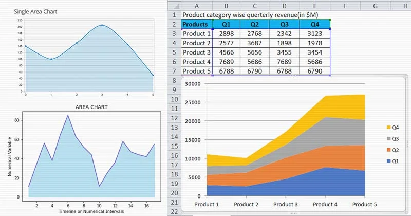
An area chart is a type of graph depicting a time-series relationship. Usually, its overall design involves plotting data points on a Cartesian plane, connecting them with lined segments, and then filling the area between the line and the x-axis with color or texture.
This type of chart can effectively display changes over time for one or more groups. It draws attention to the total value across a trend by displaying the sum of the plotted values. It’s worth noting that area charts work best with data sets that have positive values.
One element that stands out in an area chart is the ‘baseline,’ which connects different points in your data. The baseline can start from zero or any other significant value based on what the chart is representing.
Terminology Basics in Area Chart Context
The primary elements are the x-axis and y-axis, denoting time and numerical value, respectively. Then, we have data points representing specific measurements taken over regular intervals.
The ‘plot area’ where these points are graphed is usually a field of white space within the chart, with gridlines in the background to help interpret the charted data. The lines connecting the data points are known as ‘segment lines.’
The surface area between these lines and the x-axis forms the ‘plot area’ filled with color or patterns. This area represents the cumulative total of the quantitative values among each interval.
Comparing Area Charts and Line Charts: Fundamental Differences
A similar concept drives area and line charts—both depict trends over time. They show individual data points connected by line segments. However, they have some distinct differences.
One key difference is the display of ‘volume.’ An area chart can be more visually impactful by showing the volume beneath the line with colors or patterns. The filled area helps users intuitively perceive the difference between data points.
A line chart, on the other hand, is a good option when we want a clear and concise view of trend data over time. It’s especially useful when you’re looking to identify the overall patterns or trends instead of comparing individual data points.
While both charts have their place in data visualization and consist of similar elements, choosing between an area chart and a line chart ultimately depends on the nature of your data and what you wish to express.
Mastering the Art of Creating an Area Chart
Creating an area chart requires a good grip on the data being represented. Start by identifying key variables that will take place on your x and y-axis. Remember that the x-axis typically represents time, while the y-axis represents a dependent variable.
Chart the data points accurately, ensuring the numbers align with the gridlines. Connect these points to create a plot line, then fill in the space beneath this line to create your area.
Remember, when selecting colors for your chart, choose something visually appealing, which also serves to represent and differentiate any separate data series accurately. Consistent use of color and textures will aid in interpretation.
Ultimately, the aim is to create a visually impactful representation of data that’s accurate, easy to read and effectively communicates the information at hand.
Final Words
Area charts are significant in data visualization, especially when representing valuable data over time. Understanding what it is, how it works and when to use it will help anyone accurately visualize and analyze trended data.