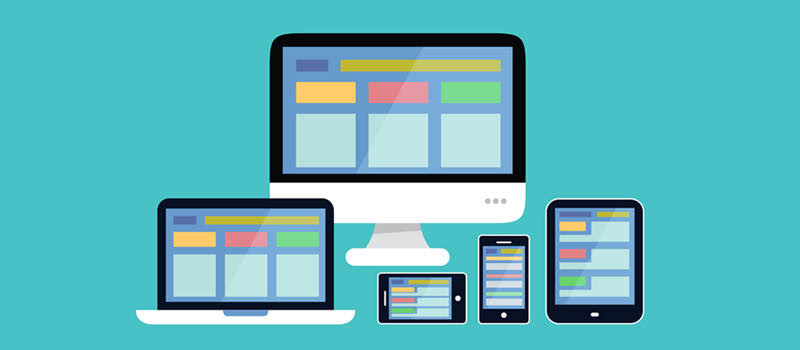
How do you browse a website? Mobile phone, tablet, iPad, laptop, or PC. Whatever device you may use, you want the website to work properly on it. Don’t you? That goes for your target audience as well. And such websites with multi-device compatibility are considered ‘Responsive.’
If you haven’t heard of this before, your website may quickly become irrelevant. To prevent that, you need to get on board with responsive web development. Yes, it’s a matter for professionals, but you can still learn a thing or two for your business’s sake.
Here’s a guide that will explain it to you in detail. Read it until the end and create a responsive web design in Brisbane.
Learning the Basics:
The growth of mobile devices has revolutionised the way people interact with the Internet. According to recent Statistics Mobile devices account for over half of global web traffic, underscoring the significance of mobile-first design principles. Further highlighting its Importance even Google Priorities responsive Websites first for Ranking.
However the Importance of accommodating various screen Sizes and resolutions goes beyond Mobile Optimisation. Designing for multiple devices Requires a holistic approach that considers the unique characteristics and user behaviours Associated with Each Platform.
This is what we discuss next.
Responsive Web Design for Multi-Device Compatibility
At the heart of designing for multiple devices lies responsive web design (RWD). It is a design approach that allows a website to adapt dynamically to different screen sizes and orientations, ensuring optimal viewing experiences across devices. For this, designers employ many strategies:
- Flexible grids
- Fluid layouts
- Media queries
In addition to responsiveness, RWD prioritises performance optimisation through optimising images, leveraging browser caching, and minimizing HTTP requests. This delivers fast-loading experiences regardless of the device used. If this is not achieved, you will not be able to see much growth in your web design in Brisbane.
Device-Specific Considerations
While responsive design lays the groundwork for multi-device compatibility, it is essential to consider device-specific nuances to optimise the user experience further. For instance, consider mobile devices:
- Touchscreen navigation is prevalent with these devices, so you need to provide larger tap targets and simplified navigation menus.
Similarly, consider smartphones and tablets:
- Optimising form fields for touch input and integrating geolocation services can enhance usability on these devices.
Conversely, take web design for desktop users in Brisbane:
- They often expect more extensive content and enhanced interactivity. So, designing for desktop devices involves incorporating hover effects, mouse-driven interactions, and expansive layouts. This lets you capitalise on the available screen real estate.
By tailoring the user experience to the unique characteristics of each device, designers can create cohesive yet tailored experiences that resonate with users across platforms.
Content Strategy for Multi-Device Design
Content is the cornerstone of any website, and designing for multiple devices requires a strategic approach to content creation and presentation. For starters, your content should be concise, scannable, and easily digestible across screen sizes.
Next, you need to prioritise content based on user context and device capabilities. For example, mobile users may have different informational needs compared to desktop users. So, do research before drawing out your content strategy. By leveraging user data and analytics insights, you can tailor content strategies to align with user preferences and behaviours on your web design in Brisbane.
You can also streamline content delivery by using progressive disclosure techniques, such as:
- Collapsible menus
- Expandable sections
Fine-Tuning the User Experience
Finally, you need to remember the iterative nature of the whole process. The repetitive nature of web design emphasises the importance of testing and optimisation in the multi-device context.
Here’s what it normally looks like:
- Conducting thorough usability testing across various devices and screen sizes.
- Identifying potential pain points and usability issues early in the design process.
- Leveraging A/B testing methodologies to compare different design variations.
- Iterate based on user feedback and performance metrics.
Similarly, monitoring user engagement metrics, such as bounce rates, time on page, and conversion rates, provides valuable insights into the effectiveness of multi-device design strategies.
By continuously refining and optimising the user experience of your web design in Brisbane, you can ensure your site remains responsive, accessible, and user-centric across all devices.
Final Message:
Designing websites for multiple devices requires a nuanced understanding of user behaviour device capabilities and design Principles. By embracing responsive web design, considering device-specific considerations crafting tailored content Strategies and prioritising testing And iteration designers can create cohesive And optimised experiences that resonate with users across platforms. In an increasingly diverse digital landscape The Ability to deliver seamless multi-device experiences is not just a competitive advantage but a prerequisite for Success.
For specific assistance, you can contact Make My Website. It’s one of the most reputed and professional web design agencies in Brisbane. So, connect with its experts if you need help with your website.


